What makes Don't Make Me Think timeless?
Recently, I’ve been re-reading books that I enjoyed in the past. Often the second read is better: you notice patterns and principles you missed the first time.
By doing so, it struck me how much wisdom can be found in relatively old texts. Most books don’t age well, though. This is especially true in the tech field, where very few books stand out the test of time.
Don’t Make Me Think by Steve Krug is an exception. Originally published in 2000 (!), revisited in 2014 it remains a great reference for anyone interested in building user interfaces.
Below are five core usability principles from the book and why they remain relevant.
Five Principles of Web Usability
1. Users don’t read; they scan.
Users are constantly in hurry. As a result, they don’t have the time to read websites so they are scanning them until they find anything that catches their attention or a link that may navigate them to something that they are looking for. This isn’t an optimal choice. That’s satisficing: choosing a “good enough” option quickly rather than searching for an optimal one. This behaviour lies at the core of human decision making.
Website creators who spend hours on polishing their distinguished texts or on organizing long lists of links on the home page must be disappointed. It’s way more effective to focus on aspects of a site that make it easy to skim. The book shows how!
2. Eliminate question marks.
If I were to pick one quote from the book, it would be:
The most important thing you can do is to understand the basic principle of eliminating question marks. When you do, you’ll begin to notice all the things that make you think in the sites and apps you use. And eventually you’ll learn to recognize and avoid them in the things you’re building.
Question marks are all elements on the interface that make us think.
Can I click it? Is this a link? Is this a form field? What’s the scope of this search? How do I start over?
Any such question that appears in users’ minds for a split of a second leads to a confusion. And every confusion needs a recovery work - very often a trial and failure. Accumulating confusions leads to frustration and general lack of confidence in how to use the site. And as the general rule says, anything that requires a large cognitive investment is less likely to be used.
3. A few mindless clicks beat one hard click.
This might be counterintuitive at first. Why clicking, say, three times to reach the desired page might be better than a single click? Shouldn’t we optimize for as few clicks as possible? It turns out that more clicks are better if these are effortless and users are confident that they are on the right track. It wins over a single click that requires more effort.
It’s connected with the second principle. Very often eliminating question marks boils down to removing unnecessary UI elements. This way you can reduce the noise and accent things that are essential on the page. Leaving users with fewer but more relevant choices makes the site easier to use.
Of course, too much clicks might become frustrating. The author provides the following formula:
(…) three mindless, unambiguous clicks equal one click that requires thought.
4. Most arguments about web usability are a waste of time.
If you ever find yourself discussing drop downs versus radio buttons, stop. It’s a dead end. Discussions about usability fall into the same category as discussions about religion or politics: the ultimate truth can’t be proven. It may be very draining and cause unnecessary erode of respect between involved parties. Also, these seldom result in anyone changing their opinion (even if someone admits the opposite!).
A better use of time is usability testing. It replaces opinions with evidence from real users using the website and often shifts the conversation by exposing larger, previously unseen problems.
The book provides a simplified framework for conducting usability testing. For a more in-depth reference, check out Steve Krug’s book dedicated to this topic: Rocket Surgery Made Easy.
5. Watch real people use what you build.
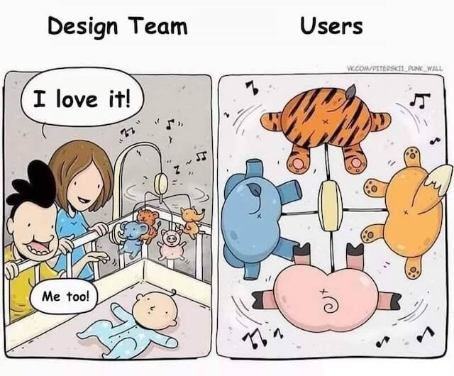
Each time I observed someone using an interface I had built, their behaviour surprised me. A few times my mental model of how a user would interact with the interface was extremely off. I guess spending hours on something completely deprives the ability to look at it from an end users perspective.
This is where delegation becomes essential. Hire someone and give them a concrete task to accomplish on your site. Watch closely, notice every small confusion or misinterpretation. That direct observation is the fastest path to meaningful improvements. Soon, you might become addicted to it as you realize that every such session improves the usability in a way you wouldn’t think of on your own.
So, what makes Don’t Make Me Think timeless?
The reason the book remains relevant is its focus on human behaviour, rather than tools or trends.
The author examined the deeply wired habits that determine how we interact with computers. This let him get the essence of what improves or degrades usability.
Chapter 12 about accessibility ends with:
When I wrote this chapter seven years ago, it ended with this:
“Hopefully in five years I’ll be able to just remove this chapter and use the space for something else because the developer tools, browsers, screen readers, and guidelines will all have matured and will be integrated to the point where people can build accessible sites without thinking about it.”
Sigh.
Hopefully we’ll have better luck this time.
If Steve would revisit it now, twelve years since the last edit, he still couldn’t free this space up. Despite the development of great HTML and CSS libraries, accessibility is still tough and it’s not a solved problem. But for our point forward, it only proves that the book very well stands out the test of time.
Get in touch
If for whatever reason you consider it worthwhile to start a conversation with me, please check out the about page to find the available means of communication.